I did research as part of my graduate work in human-computer interaction at Georgia Tech. I focused on incremental improvements to the Mastodon user interface to focus on personal relationships. I’m presenting the prototypes and data that I developed here in summary. There’s also a 45-minute video where I go over the research in detail at the end of this post.
Summary
I consider the problem of using Mastodon, the Open Source social network software, to improve our personal relationships. I did an analysis with interviews, surveys, and prototype evaluations.
My prototype included two major enhancements to the Mastodon 4.1.x user interface:
- Using the list functionality for tracking personal relationships like friends, family, colleagues, neighbours and more consistently surfacing lists in the UI
- Using encrypted direct messages for private conversations with individuals and groups
The outcome of the research was that the lists functionality was welcome but somewhat conflicted with using lists for managing broadcast messaging. Additionally, the direct-message functionality was very well received and seems to meet an important need for personal connection.
Needfinding
To perform needfinding for this project, I chose two primary forms of research: interviews and a survey. Based on the outcomes of these active forms of research, I included a secondary, more passive form: reviewing existing interfaces.
Problem space
The problem space is enhancing the Mastodon user interface to encourage more and better management of personal relationships. The interface I’m including is the desktop Web experience for end users of Mastodon, including:
- the home timeline
- the profile page
- the followers list
- The following lists
- the lists management
- direct messages
As a stream-oriented social network, Mastodon is like other interfaces such as Facebook, Twitter, Instagram, or LinkedIn. However, it’s considerably simpler than those interfaces, with far fewer features. Some of these interfaces may benefit from the research in this paper.
User types
Because ideas of personal relationships can be culture specific, I’ll concentrate on North American and European subjects. Some of the results might be translatable into other cultural contexts.
For ages, I include working age or retired adults over 18 years of age. Students or school-age children have different issues with friendship and family.
The users will range from beginner to expert users of Mastodon or other social network software. The interface should be useful for someone just onboarding to Mastodon, as well as someone who has an extensive social network already in place.
Survey
I used a survey to understand patterns of how people use apps and other software to maintain their personal relationships. Understanding these patterns would let me apply them to the Mastodon interface as well.
In order to recruit for the survey, I shared to my peers at Georgia Tech in the CS6750 class; to my followers on Mastodon; and to my friends and family on Facebook.
Questions
I asked the following questions four times, for each of the relationship types: friends, family, neighbours, colleagues.
- What apps do you use to connect with friends/family/neighbours/colleagues? Choose all that apply. (Choices: Email, Phone, SMS, Facebook, Twitter, Instagram, LinkedIn, Nextdoor, Snap, TikTok, Mastodon, Signal, Telegram, WhatsApp, Reddit, Discord, Slack, Zoom, Microsoft Teams, Google Meet, Other)
- How often do you need to check in with each friend/family member/neighbour/colleague? (Choices: Daily or more, Weekly, Monthly, Annually or less)
- Which of these features do you use to connect with friends/family/neighbours/colleagues? Choose all that apply. (Choices: Direct message, Group message, Make your own new post (text, photo, video), Like their posts, Share their posts, Comment on their posts, Other (please specify))
- Do you use a personal relationship manager app?
- Anything else you’d like to share about digital tools and personal relationships?
Results
There are a few important results that are worth noting:
- Very few respondents (4%) use a dedicated personal relationship manager (PRM) app.
- A large number (72%) of respondents use SMS to stay in touch with friends and family (76%), but not as much for neighbours or colleagues.
- Other messaging apps like Signal (40%), Telegram (28%), and WhatsApp (52%) are also important for friends.
- Email (64%, 56%) and phone (60%, 72%) are important for friends and family.
- Email (84%), LinkedIn (32%) and Slack (44%) are the main ways to stay in touch with colleagues.
- Facebook (44%) is a stream-oriented app that’s important for keeping up with friends and family, with Twitter, Instagram and LinkedIn far behind.
- Friends and family members are contacted about weekly (48%, 52%) with significant tails for daily and monthly.
- Colleagues are contacted about daily (56%).
- Neighbours are contacted annually or less (48%).
- Direct messaging and group messaging features are very important for friends, family, and colleagues.
- Traditional stream-oriented social network features like posting, liking and commenting are only somewhat important for friends, slightly for family.
Interview
In the interviews, I recruited seven interview subjects from my extended Mastodon network. I asked for subjects who didn’t know me personally. Five subjects were women, two were men. Five were working, one was on disability, and one was retired. Two were in Europe, and the rest were in North America.
Interview questions
I asked the following questions about how the subjects used Mastodon.
- How long have you been on the fediverse?
- How many accounts have you had?
- Which of these features do you use: home timeline, local timeline, federated timeline, lists, hashtags, direct messages, echo groups? How do you use them?
- How often do you check Mastodon?
- How do you access it: mobile web, official mobile app, third-party mobile app, desktop web, other?
- How do you find your friends from other services or real life on Mastodon?
- How do you make new friends on Mastodon?
I also asked about their use of other platforms, with essentially the same questions as were in the survey.
Results
The interview results are as follows:
- Few of the subjects used direct messages more than weekly, and most hadn’t used them at all.
- Few of the subjects used the lists feature for organizing friends into groups.
- Many of the subjects had home timelines that overflowed, even though they check the timeline daily or more often.
- Few of the subjects followed hashtags; none used them for group conversations.
- None of the subjects used echo groups; most hadn’t heard of them.
- Many of the subjects had a sense of affinity and community about their instance.
- Few of the subjects made new friends on Mastodon.
- Few of the subjects were able to find existing friends on the social web. Those who had found friends either had accounts on the same instance, found people through a specific tool for migrating Twitter accounts or something similar, or had come upon friends by accident.
- Most of the subjects reported using SMS, Signal, WhatsApp, Telegram or Facebook Messenger for staying in contact with friends and family.
- Some of the subjects used group chat features for staying connected with a group of friends.
Evaluation of Existing Interfaces
The interviews and surveys showed that users were depending on messaging platforms to stay connected with friends.
To help understand these needs better, I did a review of the interfaces of popular existing messaging platforms: Facebook Messenger, WhatsApp, Signal, and Telegram.
To execute this evaluation, I compared interface elements across the different platforms. I considered how the interfaces used common signifiers to communicate affordances.
Results
The messaging interfaces for popular platforms are remarkably similar. This may be a case of convergent design; as users have become accustomed to a particular design style, they expect it from other messaging applications.
The messaging platform interfaces include several important common components.
- A conversation list. The conversations that the user is part of are listed on the left side of the screen, in reverse chronological order by last message. The other participants in the conversation are included in the list.
- Chat history. The messages that have been posted in the conversation appear in the right panel. They’re in chronological order, from the oldest to the newest. Each message has an avatar of the sender, their name, and a timestamp. Messages sent by the user have a different interface; either a different font or colour, or the avatar is positioned on the right instead of the left.
- Message-posting interface. At the bottom of the chat history is an area to type a new message, and a button for sending the message.
- Image attachments. It’s possible to attach images or other files to a message. For some messaging platforms, there are a few different kinds of attachments that can be made; for others, a simple paperclip lets the user choose a file from their computer to send.
- Group conversations. The user can send messages to a group of other users. They can name the group and change the name.
- One-on-one conversations. The user can send messages to a single user.
- Conversation search. In the top left, there’s a search bar for finding text in the conversations. Entering a search term will filter the conversations to only those that have a chat history that includes the term.
- New-conversation affordance. In the top left, there’s a button for starting a new conversation.
Requirements
Based on this research, I came up with a list of potential requirements for focusing on personal relationships.
- Show the user’s friends.
- Let the user message their friends 1-on-1.
- Let the user message their friend group.
- Let the user organize their social network (followers, following) to mark who is a personal friend, family member, acquaintance, neighbor, colleague.
- Show metadata about their relationship, like duration or frequency of connections.
- Show metadata about their friend, like last post.
- Remind the user to contact friends who haven’t been contacted for some period of time.
- Let the user connect with friends who aren’t yet on Mastodon.
- Let the user invite friends to come to Mastodon.
Design Alternatives
Considering design alternatives is an important part of the user-centred design process. Based on these interviews and requirements, I did some brainstorming on potential updates:
- Add friends to a list on the list interface
- Follow/followers interface lets you add people to a list
- Standard set of lists “Friends”/”Family”/”Neighbours”/”Colleagues”
- Change the home page to focus on people rather than reverse-chron activities
- Show your network – people you’re connected to
- Show a list of people with their last update
- Send a notification when a friend or family member posts
- Send a notification when a friend or family member hasn’t posted in a while
- Provide prompts to get people to engage with friends. “Post a picture of you and @x and tag them.”
- Another prompt: “Describe an event that happened between you and @x.”
- Allow adding people to list of followers by email, so you can include them in your updates.
- Improve the messaging interface.
- Make the messaging interface work more like another messenger app.
- Keep track of multiple conversations with the same person.
- Make the direct messaging interface separate from the public posting interface.
- Don’t show direct messages in public posts.
- Use a clustering algorithm to kick off the lists.
- Make posts just to a list.
- A tool for inviting friends to the fediverse, that results in a follow if the person registers.
- Bootstrap social network from Facebook.
- Bootstrap social network from phone contact list.
- Bootstrap social network from Instagram, if possible.
- Make introductions – help with friend onboarding.
- Group messaging interface; keep usernames out of band, so they don’t clog up the conversation.
- Sorting of home timeline by how the post will affect your relationships.
- Prompt to make introductions if someone’s social network is bare.
- Prompt to connect with 5 close friends, 15 good friends, 50 wider friends.
- Friend scores.
- Emotional valence on posts.
- Prompt to respond to friends’ posts. “Evan just posted a photo. Want to check it out?”
- A way to invite other friends to comment or like a post. “Share post with a friend.”
- Propose games for groups of friends. “Have you tried OpenFarmGame?”
- Friendship challenges.
- Triadic closure – B follows C, do you know C?
- Limit number of people you can follow to Dunbar’s number.
- Only allow mutual follow, not one-way follow.
- Separate interface for one-way follow and mutual follow.
- Search by notes on account
- Use hashtags on accounts like lists
- Show lists on account page
- Visualization for friends – like a network graph – show them closer and farther away based on how recently you engaged and how
- Organize direct messaging like Facebook, WhatsApp, or Signal
- Search direct messaging conversations to find one you were part of before
- Post only to friends
- Default setup is friends only
- Mutual friends is the default
- Post to friends shows up in direct messages interface
- Enable end-to-end encryption, remove scary warning message
- Keep direct messages and public messages distinct. Separate interface for sending direct messages.
- No-distractions chat interface – like a text message thread.
- Don’t show private messages in other streams
- Different background colour for other streams
- Offer to add to a list as soon as you follow someone
I reviewed these alternatives and identified two key themes that I thought would be worth prototyping:
- Representing relationships with list membership, pre-building relationship lists, and surfacing those relationships more in the interface.
- Bringing the direct message interface more in-line with other messaging systems from other social networks.
Prototype
I made an initial set of sketch wireframes using the drawing program Inkscape, and did a pilot evaluation with a colleague. Based on these sketches, I created higher-fidelity wireframes in the Figma app. I tried to downplay the actual content of the posts using lorem-ipsum content. I also used simplified vector avatars for the users’ pictures, developed by user Creative Stall of the Noun Project and made available under the Creative Commons 4.0 Attribution license.
I considered using a free icon set for the controls on the Mastodon interface but decided instead to use corresponding emojis from the Unicode codebase. This made the interface building process quicker at the expense of fidelity, although the medium fidelity may help subjects concentrate on the interface changes.
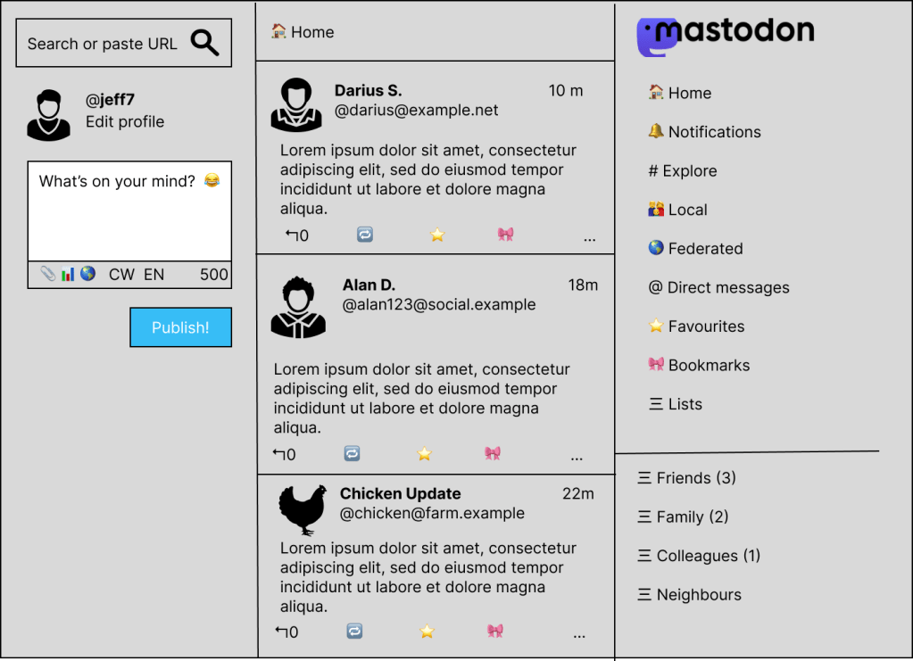
- Revised home timeline with pre-built relationship lists.
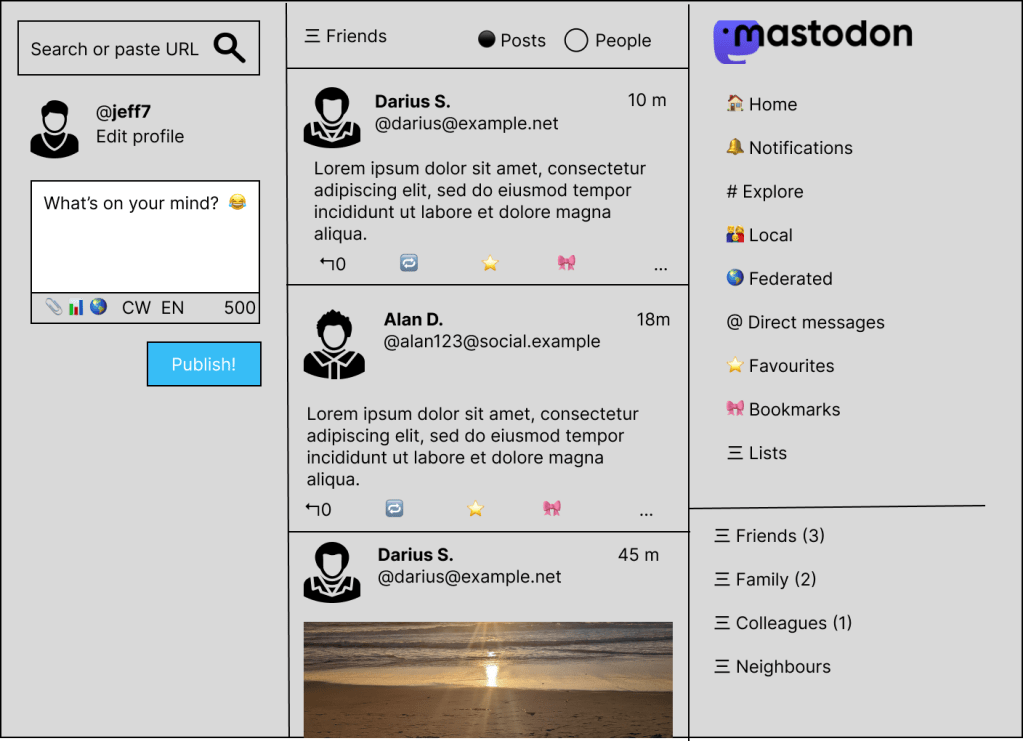
- A Friends timeline that can be displayed by Posts or by Person.

- The Friends timeline in People mode.
- A user profile with lists shown.
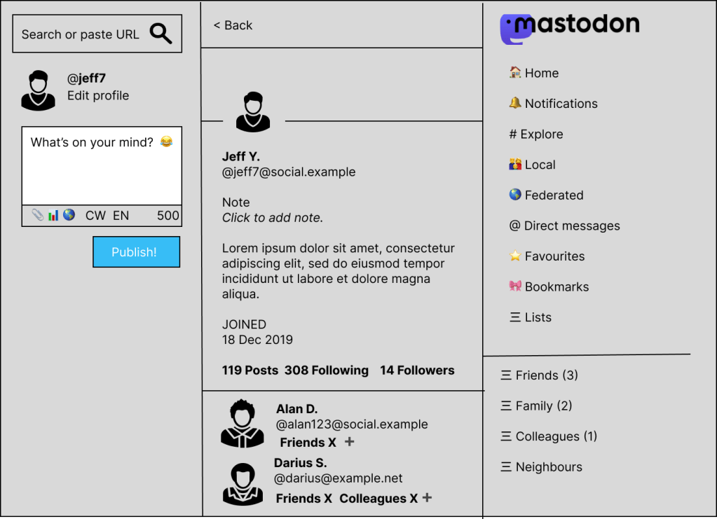
- The user’s own profile with list management integrated for following accounts.

- The posting interface for Mastodon. Unchanged, but needed to give context to the updated addressing interface.
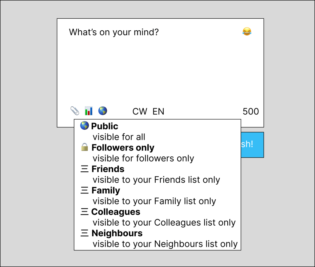
- An updated addressing drop-down, including lists, with direct messaging removed.
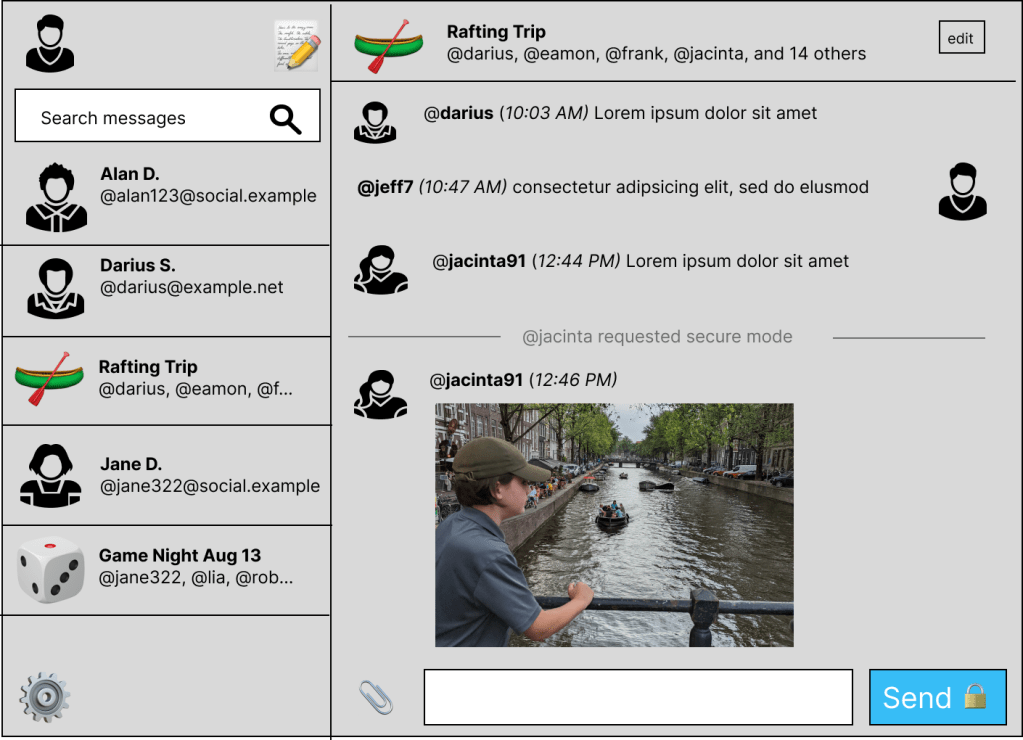
- New direct messaging interface, including conversation picker and chat history.
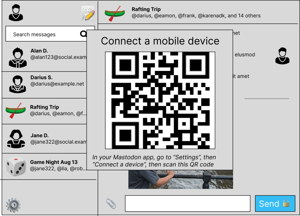
- Interface for sharing end-to-end encryption keys with another device.
Evaluation
I performed two evaluations on this revised prototype: a heuristic evaluation based on design principles, and a set of interviews with Mastodon users.
Heuristic evaluation
The first thing I did in this interface redesign was make a mapping for representing the user’s relationship with another account. To do this, I used the notes from interviews that suggested “lists” were a good way to capture this. We can represent that B is a friend to A if A has B on their “Friends” list.
Once this was established, I proposed that a certain number of lists be added automatically when the user signs up. These lists are:
- Friends
- Family
- Neighbours
- Colleagues
This collection of lists is culturally dependent, and primarily maps to ideas of close relationships in the real world.
Enabling this set of pre-made lists bridges the gulf of execution for the user. They don’t have to make each list one-by-one; they are generated automatically by the system on sign-up.
Note that there is not a pre-made list for parasocial relationships – that is, one-way relationships with celebrities, influencers, or other broadcasters. This constraint keeps users focused on the relationships that matter in their life and lead to better mental and physical health (APA).
Clearly, a different set of pre-made lists would be needed at signup for different cultures. In addition, users can rename or delete lists, or add new lists that make more sense for themselves.
Putting the list of friends on the main menu of the application provides an affordance for an important action: finding out what the user’s friends are doing. Using a menu link makes this discoverable; the user can understand that navigating to the friends list is like navigating to other parts of the app.
The number next to the list name is the number of unread updates posted by users on the list; it makes the state of the friends perceptible to the user.
The original list interface includes the latest posts from all users on the list in reverse chronological order; this can flood out infrequent posters with the content from frequent posters. In the redesign, I’ve added a mode to show the most recent post by each member of the list. This makes it easier to see what has been happening lately with each person. It changes the representation from a stream of activities to a set of people.
For the account page and the list of followers and following, I added information on list memberships, and a way to delete or add memberships. This introduces some consistency; whenever you see an account represented in the interface, it will include the relationship status as represented by list membership.
Another addition was being able to make posts that were only visible to Friends. This establishes a mapping with the real-world relationships that the user has; making posts visible only to friends, only to family, only to colleagues, etc. Adding an affordance for friends-only posts in the posting interface in Figure 7 lets users make that kind of post without depending on direct messages.
Another step, to make things more tolerant of error, was to remove the direct messaging interface from the regular posting. This keeps users from mistakenly posting public messages that they intended to be private.
The final re-design in figure 8 was the biggest step. Subjects in the needfinding interviews and survey noted that direct messaging was an important way they stayed in touch with friends.
The accounts and groups that the user has had previous DM conversations with before are listed on the left. This introduces a representation of conversations as an ongoing structure in the system.
There is also a search box, at the top left, to allow searching for previous conversations. If the user has had many DM conversations, it may be difficult to scroll back in time to find the one with a particular person. The search introduces an affordance of putting the person, and not the message, at the centre.
Mastodon currently includes a scary warning that messages aren’t end-to-end encrypted. In this redesign, I’ve imagined an affordance in which encryption can be enabled if needed. This adds a level of ease to the process. It also introduces a level of equity for users who need additional privacy, such as members of marginalised groups.
Group threads were an important part of keeping in touch with friend groups for the needfinding subjects. I added a mechanism to keep group threads active, and to name them. The long list of addressees in each message is not necessary; each participant just sends to the group, and the system sorts out where the message should go.
The message history isn’t shown as a series of posts, as in the existing Mastodon interface. Instead, it has a conversational aspect, with each party in the conversation appearing on different sides of the screen. This is consistent with other messaging apps.
Direct messages are divided by date, so it’s clear how long ago a conversation happened. This adds a level of perceptibility to the age of the conversation.
As mentioned above, the interface for posting a direct message changed to a separate input box. It’s possible to manage all the messaging interface here, to make it simple for the user.
One addition to the user interface that’s necessary when we introduce end-to-end encryption as a concept is having a way to share private encryption keys between client apps, like desktop browsers and mobile devices. In Figure 9, I used a consistent interface that’s presented in other end-to-end encrypted messaging products.
Interviews
This new interface adds variations on features already existing in the system, so I think it makes the most sense to use a qualitative evaluation type. I considered creating a survey, but I need some higher-bandwidth feedback. So, I think a group of interviews makes the most sense here.
I recruited subjects from my extended social network on Mastodon. I had more volunteers than I needed for the initial need-finding, so I asked the extra participants to be part of my evaluation, and invited another cohort to fill out the subject list. I scheduled interviews on Zoom and asked to record the sessions. I then shared my screen with the subjects, and asked them questions about the interface.
Because the prototype is not clickable, I am primarily evaluating for accuracy, learnability, memorability, and satisfaction. I want to know if the user can execute the task of staying in touch with friends using this interface.
Interview questions
I walked through these questions with each subject.
- What does this home timeline interface represent?
- How are the posts in the middle selected and sorted?
- How would you use this interface to connect with your friends?
- How would you find what your friends are doing?
- What do you notice on the Friends timeline page?
- What does selecting “Posts” do? What do you think selecting “People” would do?
- Why are the posts in the middle selected and sorted the way they are?
- When we select “People”, why are the posts shown selected and sorted the way they are?
- Do you recognize this interface (profile)? Tell me about parts of the interface we see.
- What do the “Friends” and “Neighbours” in the middle of the profile mean?
- How would you add this person to a list?
- How would you remove this person from a list?
- Do you recognize this interface (own profile, following)? Tell me what you notice about the list of people you’re following.
- What is your relationship with this person?
- What do the “Friends” and “Colleagues” in the middle of the profile mean?
- This is zoomed in on a part of the interface (composition section). Do you recognize it? What is it for?
- How would you select who can see your post?
- Tell me what’s happening with this list that pops up when you click the globe. What do the list entries mean?
- Are there any list entries that you notice are missing?
- This is a new interface not currently part of Mastodon (direct messaging). Can you tell me what it’s for?
- Can you tell me what the different parts of the interface are for? What do they do?
- What do we see on the screen on the left (conversation panel)?
- What do we see on the right (chat history)?
- Who can see these messages? How do you know?
- What would happen if you clicked on “Jane D.”?
- How would you change the name of the group?
- How would you send an image to the group?
- How would you start a new conversation?
- What does this search box do?
- What is happening on this screen (QR code)? Explain how you would get here, and why.
Summary results
I did five interviews with experienced Mastodon users; four were in North America, and one in South America. Two were women and three were men. All were between 20 and 60 years old.
- In general, the users were able to identify the parts of the Mastodon interface that the prototype pages corresponded to.
- Users were mostly aware of how the home timeline was sorted and selected; one thought it was by people on the same server.
- When asked how to connect with friends, some users suggested liking or replying to posts in the list; others suggested making a new post. Most of the users were able to find the “Friends” list in the lower right, and to identify what it was for.
- The users partly understood the Posts/People selection in the list flow. Three of them understood immediately, and the fourth was able to identify it after seeing both options prototyped. The fifth had a very hard time grasping the concept.
- The prototype interface for adding and removing people with x’s and +’s from lists was mostly recognized. One subject though the x represented the number of friends the user had in comment with the person in the profile.
- All of the users understood how selecting a list for visibility of posts would work. Two asked for a way to send to multiple lists.
- Four of the users commented on how tedious it was to manage lists by hand on other platforms like Google+ or Twitter.
- Four of the users saw that the direct messaging option was not available on the drop-down menu. One noticed that the “unlisted” option was unavailable.
- All of the subjects were able to identify the direct messaging interface as a messaging platform. Four of them referred to its resemblance to other platforms they were familiar with.
- All of the subjects understood the left conversation menu, and what selecting a conversation from the list would do.
- All of the subjects identified the way to start a new conversation.
- All of the subjects understood that the messages would only be visible to participants. Some understood clues like the lock or the “secure mode” notification that signaled the use of encryption. One person thought it might mean “disappearing messages” as in Signal or Snapchat.
- One subject asked how they could tell if a message was encrypted or not, wondering if there should be a lock icon on secure messages.
- Four of the subjects recognized the QR code interface for sharing encryption keys, and described how it was used. None of the subjects used the term “key” or “private key” here; they concentrated on “connection” or “sharing”.
- One subject confused the term “friends” for “people who follow me and who I follow back”. They tried to explain the interface in those terms. When they saw the list for “neighbours”, they assumed that it was for other users on the same server.
The mapping between relationships and list membership in Mastodon was a partial success. The evaluation subjects were able to identify the mapping and understand how it could be useful. They appreciated the affordances for managing those relationships.
The mapping interfered somewhat with other representations the subjects had. They saw lists as a way to switch between groups of people they followed, something like television channels. The idea that friends are mutual connections also caused some confusion.
The direct messaging interface was successful and welcomed. Many of the subjects were confused and suspicious of Mastodon’s existing DMs and said that they had held off from using them. Even the complexity of sharing end-to-end encryption keys between clients using QR codes was familiar and not intimidating.
Next steps
One topic that came up during evaluations was the idea of tags for other people. Tags are like categories, but objects can have many different tags. This would be an easy way to put people in more than one group, and to slice and dice the groups in interesting ways. I’d like to take the next step of evaluating if using tags for people interferes with or complements the existing list structure and if either one, or both, is better for strengthening relationships.
Another issue that came up during the evaluation was the difficulty of creating and maintaining lists. I’d like to investigate ways to improve this experience, such as using clustering algorithms to group the user’s social graph, or giving conversational nudges in notifications or in the interface. “Is Darius your friend?”
One of the key refrains that came up on both needfinding and evaluation was how hard it was to bring friends to Mastodon. The problem of referral or viral loop is important here. I’d like to investigate interfaces for inviting friends via email or through other platforms and giving an easy onboarding experience for those friends.
The direct messaging interface was the most promising part of this investigation. I’d like to create a more in-depth clickable prototype of a standalone Mastodon client that manages direct messaging with end-to-end encryption. A working prototype would be a good follow-up after that.
Two different system objects – group chats and lists – are used in this interface to represent people you have relationships with. None of the evaluation subjects noted this, but it may be interesting to evaluate if these two concepts can be united, or if that’s unnecessary. Facebook, for example, has lists, groups, and group chats, and it doesn’t inhibit use.
Although this investigation surfaced relationships more in the Mastodon interface, it didn’t provide any visualisations of the status of those relationships. I’d like to explore this visualisation aspect further, such as with a graph, and use colour, distance or other indicators to indicate health of the relationship.
Finally, this investigation didn’t provide any affordances for taking positive steps to maintain and improve relationships. Although making those relationships more visible should help, I’d like to investigate ways to encourage the user to reach out to people they care about, in the time and manner that will be most effective.
One thought on “Re-designing the Mastodon User Interface for Better Personal Relationships ”